Building apps at Shape is something people are proud of. We don’t come here to play it safe, but to learn and do our best work yet. Work that does not include compromises on craft and quality. We believe that the services and experiences we ship need to be as frictionless, effortless, and beautiful as possible to deserve a place in people's everyday lives.
One of the many things we’re proud of at Shape is the consistency of our app quality. This is only realised through a tight collaboration between design and development at the right moments. We ensure breathing space for both designers and developers to focus on their craft, and also invite for collaboration when it’s needed. The balance between deep-work and collaboration ensures that we compromise as little as possible on the vision for interface and interaction design, while still shipping stable, performant and well-built apps.
There are multiple stages involved but today I’ll focus on Design Reviews. Let’s quickly sum up the other stages before we get started.
- Collaboration in development and design
- Platform alignment
- Design reviews
Establishing a Common Ground Between Design and Development
Collaboration in development and design is a topic that deserves its own article, but to sum it up, before starting development we have kickoff sessions where developers ask as many questions as possible to the proposed design. This typically uncovers edge cases, areas to look further into and in general getting everybody onboarded onto the features in a good way to ensure a solid foundation of the development. This is also where designers can explain or showcase custom interactions and intended behaviour in certain interfaces.
During development designers are in a supportive role of developers, meaning that missing states, logical challenges or other issues arising can be dealt with in a shared space between developers and designers, coming up with solutions in collaboration. Typically Design have moved on to other client projects while development is ongoing and the supportive role is a solution to not bottleneck the building process – essentially being more effective.
How Platform Alignment Ensures Consistency
When a release is considered feature-complete, platform alignments are conducted. This is a type of collaboration where developers from each platform sit together and carefully walk through all features to ensure consistent behaviour, UI and interactions across iOS and Android. This ensures that when a product or feature has been through platform alignment, the product is now consistent across platforms and upholds the custom design and still utilises native OS behaviour expected for some parts of the experience.
Design Review: The Final Checkpoint
When a feature has been through Platform alignment, it’s officially ready for Design Review. This is the final stop before it goes to Quality Assurance and a release candidate will be ready.
The main objective of Design Reviews is to make sure that minor details of the interface and interaction design is up to par on what was originally intended. This also acts as a final sanity check with designers, to see if anything has been missed through the previous collaboration and platform alignment.
The mix of collaboration with engineers during development and platform alignment, allows the Design Review to only focus on minor and tiny details – which is extremely valuable and something that enables Shape to ship high quality products, since we’ve had time to go through all minor details – because major things have already been aligned earlier in the process.
Preparation
- Before meeting up, designers have had the chance to download and look through the feature on their own device using Shape's custom-built test platform ShipShape.
- The tech lead has an overview of what has been done and what is supposed to be reviewed.
The Setup
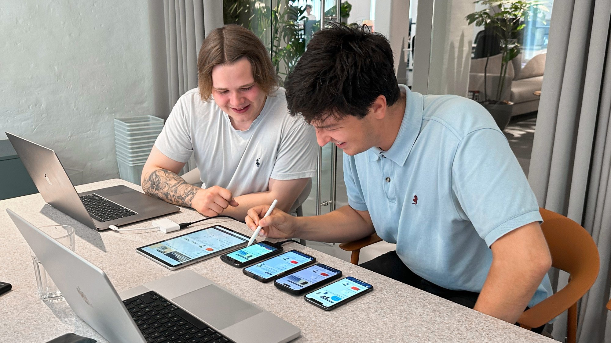
- Lead designer and one developer per platform meet up.
- The feature is running on multiple physical devices – usually two sizes per platform.
- Each platform developer sits on each side of the designer, with the designer in the middle.
The Review
- The designer goes through the feature and its different success and error states. When going through it, it’s noted down by developers what things need to be tweaked or fixed.
- It can be something like “The spacing between the title and description should be increased by 1-2 pixels”
- It can also uncover potential areas where a closer collaboration between design and development is needed for a separate session – e.g. to tweak the timings of animations or asynchronous loading sequences.
After the review, each developer ends up with a relatively short list of things to tweak in the coming days. When the tweaks have been implemented, it depends on the size of the feature whether another review is needed or not.
Learning and Evolving Together
Conducting these types of reviews and early QA sessions over the years, results in seasoned developers and designers that learn from each other every time.
E.g. developers can often ask designers for missing scrolling states, error and empty states. While developers will develop a gut feeling for when an interface looks good and when spacings are off.
Improving the intuition on what is needed from designers and what developers need to also focus on, helps us all make better apps because we get a better understanding of the playing field while continuing to push the boundaries of what great apps are.


